
by Adrian Worton
Last time we unveiled the TGIAF Premier League simulator. Whilst it is a sturdy model which uses form to dictate odds for matches, and therefore the probability of each team winning, it has thrown up results which seem to volatile, with smaller clubs like Crystal Palace, Sunderland and Stoke City often fighting for the title, and with large clubs such as Man United, Chelsea and Spurs just avoiding relegation.
As we want our model to be as realistic as possible, to allow us to do more interesting analysis with it, we now need to consider what has gone wrong with it, and how we can improve it.
Upsets
Given how our model is seeing upsets in the long term, with teams performing way above/below what we would reasonably expect, it follows that we may be seeing too many upsets within individual matches.
Therefore, we will run our simulator 100 times, and count the number of favourite wins, draws, and upsets (similar to how we tested our World Cup simulator). We will then compare this with the proportions of these results in our database of real-life results. These results can be seen in the graph below:
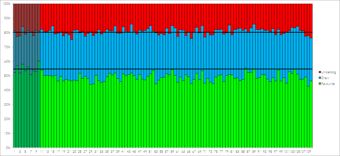
The ten dark columns at the start indicate the ten real seasons in our database, whilst the lighter columns are our simulations. The horizontal lines indicate the average across our ten real seasons.
From the graph we can see that our proportion of underdogs who win is pretty much spot-on (real life: 19.97%, simulations: 19.28%), however, it is also clear that we are seeing far too many draws (real life: 25.47%, simulations: 31.81%), and not enough victories for favourites (real life: 54.55%, simulation: 48.91%).
Therefore, one possible solution will be to weight our odds to make a favorite victory slightly more likely, at the expense of a draw.
Distribution
In real life, the teams in mid-table are more likely to be closer to the bottom of the table than the top. In other words, the gap between the mid-table teams to the top team is generally much larger than the gap between the mid-table teams to the bottom club.
Therefore, we can see if our model is throwing out results which follow a realistic pattern by considering the following three values:
The slideshow below shows the difference between the real-life data (the darker columns, with the average shown by the horizontal line) and the simulations (lighter columns). Use the arrow icons to cycle between the three graphs.
From the graph we can see that our proportion of underdogs who win is pretty much spot-on (real life: 19.97%, simulations: 19.28%), however, it is also clear that we are seeing far too many draws (real life: 25.47%, simulations: 31.81%), and not enough victories for favourites (real life: 54.55%, simulation: 48.91%).
Therefore, one possible solution will be to weight our odds to make a favorite victory slightly more likely, at the expense of a draw.
Distribution
In real life, the teams in mid-table are more likely to be closer to the bottom of the table than the top. In other words, the gap between the mid-table teams to the top team is generally much larger than the gap between the mid-table teams to the bottom club.
Therefore, we can see if our model is throwing out results which follow a realistic pattern by considering the following three values:
- Top half range - the difference between the team in 1st and the team in 10th
- Middle half range - the difference between the team in 6th and the team in 15th
- Bottom half range - the difference between the team in 11th and the team in 20th
The slideshow below shows the difference between the real-life data (the darker columns, with the average shown by the horizontal line) and the simulations (lighter columns). Use the arrow icons to cycle between the three graphs.
The averages for our three graphs are as follows:
This suggests that in our simulations there is not a big enough gap between the top clubs and those in the league's peloton. This is how clubs who in real life would be happy with a mid-table finish, such as Stoke, can find themselves challenging for the title in our simulator.
Whilst our earlier suggestion of weighting our odds to suit favourites even more might help with this effect, we also need to consider if there needs to be something within our calculations, more than form, which can drive the bigger clubs on to dominate the league in more simulations.
Form
So far, the only measurement we have used to determine how good a team is is their form over the last 38 matches (which we found to be the best form predictor of odds). A major problem with this is that the teams' abilities for the 2014/15 season are fundamentally locked by their end positions in the 2013/14 season.
In other words, in our simulator Everton are, on average, going to be stronger than Manchester United, despite the fact that this was the first time the 1989/90 season, that Man United have brought in a new manager, and that bookies have Man Utd as roughly 20 times more likely to win the league than Everton. Similarly, the summer's dismantling of Southampton is not recognised within the model, as it purely goes from their results last season.
Therefore, is there a new factor we can include into our analysis to get a more likely series of simulator results?
In the fantastic book Why England Lose, they compare clubs' spending on wages to their league position, and find a very strong relationship (R^2 of 0.89), a much stronger relationship than transfer spending. This means that if we can find the data for clubs' wage budgets, we can look to include this into our model, as it will favour the bigger clubs, and counter-act the variability in our model.
However, finding data on wages is not straightforwards, as clubs only publish data a year after the season has ended. Despite this, we will try and pursue this avenue.
Summary
We have been able to look at key statistics from multiple simulations, and compare them with real-life data in order to see exactly why our model is behaving unrealistically.
Our suggestions for how the model can be improved will hopefully bring back realism into our model, and make sure our next version will be worthy of the work gone into it!
- Top half - real life: 39.4, simulations: 24.3
- Middle half - real life: 21.0, simulations: 20.3
- Bottom half - real life: 21.7, simulations: 29.0
This suggests that in our simulations there is not a big enough gap between the top clubs and those in the league's peloton. This is how clubs who in real life would be happy with a mid-table finish, such as Stoke, can find themselves challenging for the title in our simulator.
Whilst our earlier suggestion of weighting our odds to suit favourites even more might help with this effect, we also need to consider if there needs to be something within our calculations, more than form, which can drive the bigger clubs on to dominate the league in more simulations.
Form
So far, the only measurement we have used to determine how good a team is is their form over the last 38 matches (which we found to be the best form predictor of odds). A major problem with this is that the teams' abilities for the 2014/15 season are fundamentally locked by their end positions in the 2013/14 season.
In other words, in our simulator Everton are, on average, going to be stronger than Manchester United, despite the fact that this was the first time the 1989/90 season, that Man United have brought in a new manager, and that bookies have Man Utd as roughly 20 times more likely to win the league than Everton. Similarly, the summer's dismantling of Southampton is not recognised within the model, as it purely goes from their results last season.
Therefore, is there a new factor we can include into our analysis to get a more likely series of simulator results?
In the fantastic book Why England Lose, they compare clubs' spending on wages to their league position, and find a very strong relationship (R^2 of 0.89), a much stronger relationship than transfer spending. This means that if we can find the data for clubs' wage budgets, we can look to include this into our model, as it will favour the bigger clubs, and counter-act the variability in our model.
However, finding data on wages is not straightforwards, as clubs only publish data a year after the season has ended. Despite this, we will try and pursue this avenue.
Summary
We have been able to look at key statistics from multiple simulations, and compare them with real-life data in order to see exactly why our model is behaving unrealistically.
Our suggestions for how the model can be improved will hopefully bring back realism into our model, and make sure our next version will be worthy of the work gone into it!
 RSS Feed