
by Adrian Worton
Introduction
We all know the story. Premiership players are a bunch of overpaid wasters, stealing money from the nation's nurses (because for some reason, in the world of the hack, the wages of footballers and nurses are directly linked) so they can pay for prostitutes and trampolines. In the sources at the bottom of this article, you can find a link to a Daily Mail article complaining about this state of affairs. Unlike most articles though, they have handily provided us with some data to crunch. We are going to use perspective, rationalism and logarithmic scales to explore this explosive increase in the wages of footballers.
The Raw Data
The figures on the Mail site show the average top-flight wage compared to the average national wage from the years 1961 - 2010, in a list so long it's not worth re-posting here.
They start in 1961 as that was the year the salary cap was removed. It would be very hard to find accurate data for any year before the 60's - in fact the Mail's figures up until the advent of the Premier League are perhaps suspect (see later).
Instead, here is the data displayed graphically:
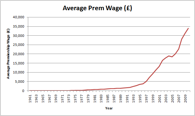
Note: in the above graph, and in the rest of this article, "Average wage" means the mean wage for all top-flight footballers. It does not mean average as in mediocre, as in "The wage of mediocre players". This seems obvious, but in the original Mail article, average is used in both senses, probably as an awful attempt at a pun.
Because of the enormity of the wages by 2010, it makes it rather hard to analyse the data. Here are a few subjective impressions based on this graph:
Logarithmic Scales
Some of you may see the above graph, and notice that it looks like is has a curve similar to that of an exponential. Exponential growth is when the numbers in a set of data grow by percentages. So for example, say the exponential rate was 10%, and the first number was 100:
The opposite function to an exponential is a logarithm. This is a little harder to explain. Put simply, the logarithms of a number grows bigger a lot slower than its 'true' value.
A logarithmic scale is one where each move upwards on a scale is actually an increase by a power. The most famous logarithmic scale is the Richter scale, used to measure earthquake magnitudes. This is in base-10. So if one earthquake measures 3.0 on the Richter scale, and another measures 4.0, then the second is actually ten times more powerful. Similarly, if another one measures 6.0 on the Richter scale, then it is 10x10x10 = 1000 times larger than the one which measured 3.0. The benefit of this is that it stops large numbers from stretching the data, making comparisons tougher.
This means we can change our initial graph to have a logarithmic scale (base-10), and get this result:
Because of the enormity of the wages by 2010, it makes it rather hard to analyse the data. Here are a few subjective impressions based on this graph:
- Wagesseem to steadily increase up until the mid 90's, after which they grow more considerably. This data is not surprising; it coincides with the genesis of "player power" - the Bosman Ruling.
- The only year wages decrease is 2005. This seems a bit harder to explain. There is certainly no single explanation. The most likely cause seems to be that 2005 just happened to be a year when footballers on high wages in England (Vieira, Kléberson, Kanouté) moved abroad.
Logarithmic Scales
Some of you may see the above graph, and notice that it looks like is has a curve similar to that of an exponential. Exponential growth is when the numbers in a set of data grow by percentages. So for example, say the exponential rate was 10%, and the first number was 100:
- The second number would be 10% greater than 100, so 110
- The third number would be 10% greater than 110, which is 121, and so on
The opposite function to an exponential is a logarithm. This is a little harder to explain. Put simply, the logarithms of a number grows bigger a lot slower than its 'true' value.
A logarithmic scale is one where each move upwards on a scale is actually an increase by a power. The most famous logarithmic scale is the Richter scale, used to measure earthquake magnitudes. This is in base-10. So if one earthquake measures 3.0 on the Richter scale, and another measures 4.0, then the second is actually ten times more powerful. Similarly, if another one measures 6.0 on the Richter scale, then it is 10x10x10 = 1000 times larger than the one which measured 3.0. The benefit of this is that it stops large numbers from stretching the data, making comparisons tougher.
This means we can change our initial graph to have a logarithmic scale (base-10), and get this result:
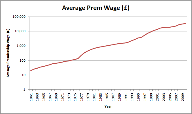
Despite the fact that this is the exact same graph, this changes the curve incredibly. We can now make some more observations:
- Wages were rising at a steady pace, up until the mid-70s, when they suddenly shot upwards. This coincides with the period where England were the dominant force in Europe - England won 8 out 9 European Cup finals between 1977 and 1984.
- This rise in wages eventually starts to slow down, and the next turning point is at the start of the 90's. This is almost certainly due to the advent of the Premier League. However, we see only a small change in the curvature here.
- From this point onwards, wages continue to rise at a fairly constant rate. The Bosman Ruling seems to have had very little effect, and the dip in 2005 becomes negligable.
- Strangely, the years in which Chelsea were supposedly ruining the Premiership with their big spending - 2003 onwards - actually see wages stay at the same rate for a while, before a late increase towards the end of the decade, possibly as Manchester City begin to flex their newfound financial muscles.
- Interestingly, there is no noticable kink at all in the graph around 1966, the year of English football's most notable triumph.
Here we can see how the wage jump in the 70's was clearly the biggest change. The other noticable chance is how much more variable the data is from the 90's onwards; from 1962 - 1975 and 1982 - 1992 the curve stays fairly smooth. However, from 1993 onwards, it jumps around like a lie detector at a government enquiry. We will explore this later.
Fairness
We now need to look at whether or not these wages are fair. Clearly, if you look at the problem like a tabloid journalist, then you will see that the average footballer gets paid fifty times more than the normal working man. However, your typical working person does not have 30,000 people turn up to watch him work each week. Clearly, footballers create a huge demand, hence their huge wages. If the newspapers really cared about nurses that much, they would feature their every actions in their back pages in an attempt to stir public interest. Instead, they continue to fuel the nation's desire for football, so obviously they can have no complaints over the size of the wages.
However, are these wages actually reflective of the demand for football? We need to look at what rate money has gone into football over the years. We could look at how ticket prices and attendences have changed; this would show how much money is being spent on football by people going to games. However, this clearly isn't enough. More fans watch games on the TV than ever, all over the world, and their viewership has resulted in the TV income for football rapidly increasing. Sponsorship, too, has increased in modern football, and this money still comes from the fans, as they (apparently) buy the products emblazoned on their heros' tummies.
This means we instead need to look at how football revenue has changed. No data seems to be readily available (it is out there; Deloitte publish an annual list of financial data for football clubs all over the world, but especially in England. Their reports, however, cost £600). However, we did find evidence which suggested that from the years since the birth of the Premier League, revenue for Premiership sides has grown by a rate of 16%. Over that period, the average growth of wages is 17.9%. These two figures are very close, and suggests that the wages earned by Premiership players is justified by the amount coming into the game.
Problems with the Data
If you take a good look at the original figures from the Daily Mail, you should spot the reason for the smoothness of the curves above. Whilst it is impressive how the Mail have found figures for years as far back as 1961, their values do not seem to be very exact. For example, for the years 1977 - 1981, the average wage for footballers goes £220, £330, £440, £550, £660. And from 1985 to 1991 the values are £1000, £1100, £1200, £1300, £1400, £1500, £1600. It is only from 1992 onwards which sees non-round numbers. This indicates that it is only from this point which the Mail has accurate figures, and should be kept in mind when discussing the data pre-Premiership.
Conclusion
We have found that Premiership footballers' wages are barely any higher than the demand for them necessitates it should be. We also found that supposedly big events which "ruined" football by being responsable for the high wages, such as the Bosman Ruling and the advent of the Premier League, had a very low effect on wages.
What did have a large effect on wages was the huge success English clubs had in Europe during the late 70's. Compare this to the lack of change the World Cup victory in 1966 had on wages, and we also can note that club success has a far higher effect on the league's wages than the national team's. This is perhaps not surprising in a country where most fans prioritise club over country, and in a sport where player wages are paid by the club.
Sources
Daily Mail - provides us with our data for player wages, as well as a beautiful example of the outrage that wages causes amongst those with no understanding of supply and demand.
Football Economy - their breakdown of the Deloitte reports has allowed us to get a figure on the annual growth of Premiership teams' revenue.
 RSS Feed