
by Adrian Worton
In our attempts to model the Premier League, we first produced one simulator, which we analysed in order to understand why it produced highly variable results. We have now created a second simulator, and now we will look to see how it has performed.
In our attempts to model the Premier League, we first produced one simulator, which we analysed in order to understand why it produced highly variable results. We have now created a second simulator, and now we will look to see how it has performed.
Subjective impression
Firstly, we will have a quick look at some results thrown out by the simulator, in order to see whether they appear to be following a realistic pattern. Below are the final standings of 20 different seasons:
Firstly, we will have a quick look at some results thrown out by the simulator, in order to see whether they appear to be following a realistic pattern. Below are the final standings of 20 different seasons:
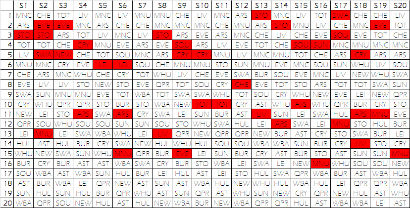
Whilst the results seem more likely than those produced by the first simulator, there are still a high number of unlikely events (highlighted in red). This suggest the simulator is still not quite right, and we will once again need to understand what can be improved.
Like our last analysis, we will compare the results of 100 simulations with the averages from the 10 Premiership seasons in our database (04/05 to 2013/14).
Distribution of results
Firstly, we will again look at how the results of the matches are spread out between the three possible outcomes: a victory for the favourites, a draw, and an underdog victory. Below are the proportion of matches ending in these results for the 10 real seasons (darker colours) and our 100 simulations. The black lines indicate the average for the real seasons.
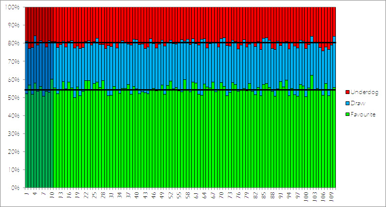
It is encouraging that our simulations follow the right distribution of results almost perfectly. The averages for the three outcomes in our real sample are 54.6%, 25.5% & 20.0%, whilst in our simulations they are 54.9%, 24.9% & 20.2%.
However, this is not a huge surprise, since this simulator is based around this distribution. What is good to see is that the variation from these averages is roughly the same between the real and simulated seasons.
Distribution of points
We will now have a look at how the points are distributed across the league, in order to see if it sheds any light onto where the model can be improved. We will measure three aspects of our 100 simulations:
Below are the graphs showing these values for the real seasons (darker colours) and our simulations. The black line indicates the average for the real seasons. Use the arrow icons to navigate between the three graphs.
However, this is not a huge surprise, since this simulator is based around this distribution. What is good to see is that the variation from these averages is roughly the same between the real and simulated seasons.
Distribution of points
We will now have a look at how the points are distributed across the league, in order to see if it sheds any light onto where the model can be improved. We will measure three aspects of our 100 simulations:
- Top half (points difference between 1st and 10th)
- Middle half (points difference between 6th and 15th)
- Bottom half (points difference between 11th and 20th)
Below are the graphs showing these values for the real seasons (darker colours) and our simulations. The black line indicates the average for the real seasons. Use the arrow icons to navigate between the three graphs.
The averages for these graphs are as follows:
We can see that our new simulation has failed to get significantly closer to the real-life values than the previous simulator.
The significant underestimation of the top half difference, and the overestimation of the bottom half difference is indicative that our model is placing the mid-table teams closer to the top than they are in real life.
Below is a graph showing the distribution of points for the 200 teams in our real-life seasons, and the 2000 teams in our 100 simulations:
- Top half: real life 39.4, simulations 29.6
- Middle half: real life 21.0, simulations 24.7
- Bottom half: real life 21.7, simulations 32.4
We can see that our new simulation has failed to get significantly closer to the real-life values than the previous simulator.
The significant underestimation of the top half difference, and the overestimation of the bottom half difference is indicative that our model is placing the mid-table teams closer to the top than they are in real life.
Below is a graph showing the distribution of points for the 200 teams in our real-life seasons, and the 2000 teams in our 100 simulations:
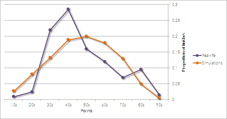
The distributions of our simulations follow an almost-flawless normal distribution (an explanation of which is available in our article on cricket batting averages), whilst the real-life data follows a much more unorthodox pattern. There are two peaks - the first is in the 40s, where we can assume that the mid-table teams end up largely residing. And the second is in the 80s, where the top three teams often find themselves.
Troubleshooting
Since our model is placing too many teams in the lower part of the graph, this indicates that teams who get behind in our simulations are too unlikely to get results to pull themselves out of the mire. And since not enough teams are in the higher parts of the graph, we see that the top teams drop too many points in our model.
Therefore, we need our next generation of the model to make mid-table teams more equal, whilst pushing the top teams further away. Some possible solutions are:
Find out next time which method we have chosen!
Troubleshooting
Since our model is placing too many teams in the lower part of the graph, this indicates that teams who get behind in our simulations are too unlikely to get results to pull themselves out of the mire. And since not enough teams are in the higher parts of the graph, we see that the top teams drop too many points in our model.
Therefore, we need our next generation of the model to make mid-table teams more equal, whilst pushing the top teams further away. Some possible solutions are:
- An additive model - currently we take two teams' form, and divide one by the other. This means the differences between teams with lower forms are magnified (for example, 1.1/0.9 is much lower than 2.1/1.9), possibly unfairly. If we change from this to just looking at the absolute difference (i.e. home form - away form) we might find it bring the lower clubs closer together.
- Transformation - a way of emphasising the difference between the lower/mid-table teams and the top teams would be to transform the form in order to exaggerate the difference for teams with a higher form score. The most obvious transformation would be squaring the form.
- Weighting - a solution which would radically change our method of modelling would be to introduce an extra weighting to our calculations, which can be used to drive the top teams further away. Possible methods for weighting could be wage budgets, bookies odds or even a subjective system akin to the star rating system in the FIFA range of video games.
Find out next time which method we have chosen!
 RSS Feed